Georgia Slave Map
![]()
This Site:
|
|
|
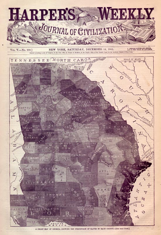
This is an original and incredible "Slave Map" for the State of Georgia. The map is from an 1861 edition of Harper's Weekly, the most popular illustrated newspaper of the day. The map shows each county in Georgia, and indicates the relative population of Slaves and Whites. Incredibly, some counties are over 85% slaves. The darker the shading of a county, the larger the slave population. The newspaper carries this description of the map: A CHART MAP OF GEORGIA.
WE publish on the preceding page a CHART MAP OF GEORGIA, similar to the
one we published of South Carolina in our Number of November 23. The
tint, by its depth of shade, shows the comparative percentage of slaves
to the total population in each county, that percentage being likewise
stated in figures in the centre of the tint. Thus in Ware County only
seven per cent of the total population are slaves, while in Chatham
County the percentage is 71, or nearly three-quarters. It will be
noticed that the largest slave communities are on the seashore and round
the points to be occupied by our troops. Chatham County, in which Tybee
is situate, contains 71 per cent. of slaves ; Glynn County, where
Brunswick is situate, 86 per cent. ; Camden County, whose sea-port is
Fernandina, Florida, 67 per cent. This map will be of use to the
philosopher and student. |
![]()
|
Email us at: paul@sonofthesouth.net. Copyright © 2003-2018 Son of the South.
|
|
|
|
Are you Scared and Confused? Click Here to read My Snake Story, a story of hope and encouragement, to help you face your fears. |
||