South Carolina Slave Map
![]()
This Site:
|
|
|
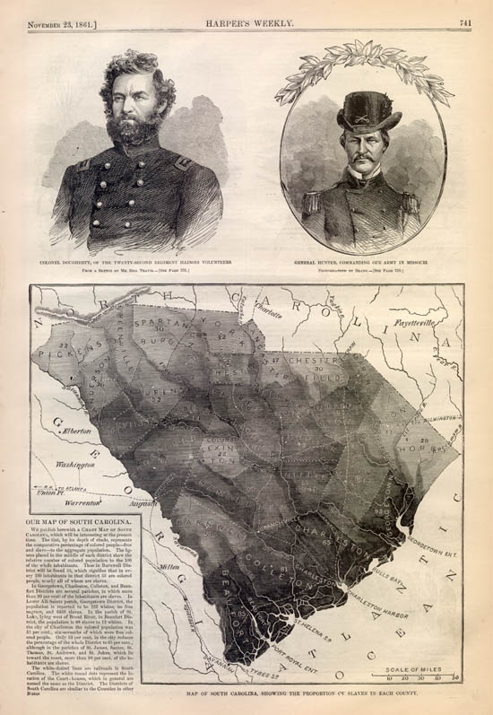
This is an original and incredible "Slave Map" for the State of South Carolina. The map is from an 1861 edition of Harper's Weekly, the most popular illustrated newspaper of the day. The map shows each county in South Carolina, and indicates the relative population of Slaves and Whites. Incredibly, some counties are over 85% slaves. The darker the shading of a county, the larger the slave population. The newspaper carries the following description of the map: OUR MAP OF SOUTH CAROLINA.WE publish herewith a CHART MAP OF SOUTH CAROLINA, which will be interesting at the present time. The tint, by its depth of shade, represents the comparative percentage of colored people—free and slave—to the aggregate population. The figures placed in the middle of each district show the relative number of colored population to the 100 of the whole inhabitants. Thus in Barnwell District will be found 53, which signifies that in every 100 inhabitants in that district 53 are colored people, nearly all of whom are slaves. In Georgetown, Charleston, Colleton, and Beaufort Districts are several parishes, in which more than 90 per cent of the inhabitants are slaves. In Lower All-Saints parish, Georgetown District, the population is reported to be 222 whites, no free negroes, and 6468 slaves. In the parish of St. Luke, lying west of Broad River, in Beaufort District, the population is 88 slaves to 12 whites. In the city of Charleston the colored population was 53 per cent., six-sevenths of which were free colored people. Only 53 per cent. in the city reduces the percentage of the whole District to 65 per cent., although in the parishes of St. James, Santee, St. Thomas, St. Andrews, and St. Johns, which lie toward the coast, more than 90 per cent. of the inhabitants are slaves. The white-dotted lines are railroads in
South Carolina. The white round dots represent the location of the
Court-houses, which in general are named the same as the District. The
Districts of South Carolina are similar to the Counties in other States
|
![]()
|
Email us at: paul@sonofthesouth.net. Copyright © 2003-2018 Son of the South.
|
|
|
|
Are you Scared and Confused? Click Here to read My Snake Story, a story of hope and encouragement, to help you face your fears. |
||