Slave Maps
![]()
This Site:
|
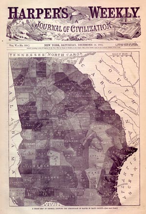
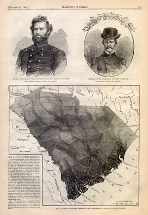
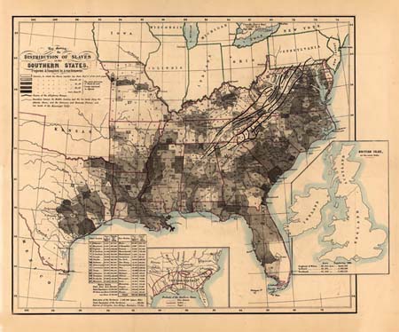
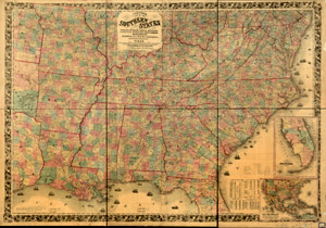
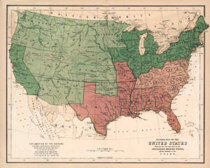
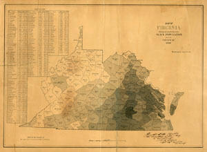
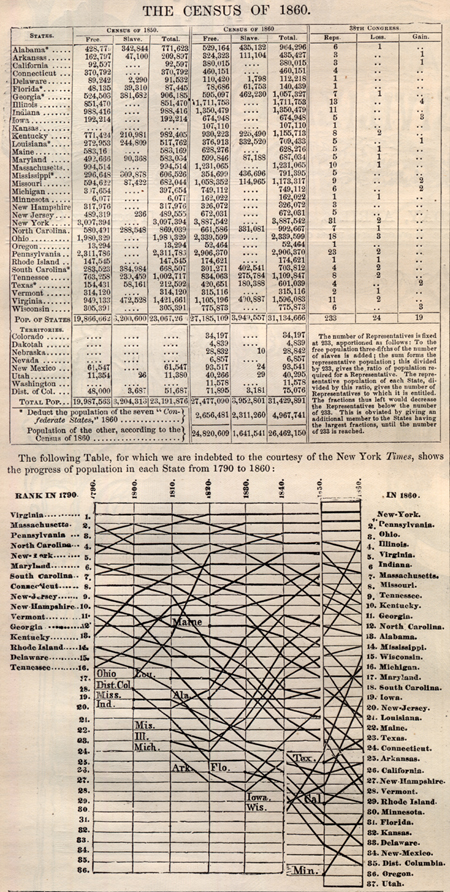
A "Slave Map" is a map that was produced to graphically illustrate the relative proportion of free and slave populations in a state or county. Some maps used colors to convey this information, while others used a gray scale, with the darker areas representing areas with proportionally more slaves. For your research and perusal, we have compiled an extensive collection of original Slave Maps. Also included are maps that simply show Northern and Southern States in different shades, or simply show "The South", with the slave population presented in tabular form on the Legend of the map. Click on the Thumbnails Below to be taken to a larger view of the map of interest. |
|
|
1861 Georgia Slave Map |
|
|
|
|
|
|
|
|
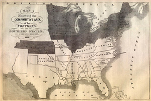
1857 Map Showing Slave and Free States |
|
|
|
|
![]()
|
Email us at: paul@sonofthesouth.net. Copyright © 2003-2018 Son of the South.
|
|
|
|
Are you Scared and Confused? Click Here to read My Snake Story, a story of hope and encouragement, to help you face your fears. |
||